Dalex Finance

Mobile App Redesign

Dalex Swift is an innovative investment product that allows you to invest from your mobile phone, using your phone number as your account number. As the first digital investment product of its kind, Swift allows investments via USSD and an android app.

Objective

Experience

Providing a better User Experience of DalexSwift by improving the user flows and the interface

Interface

Creating a brand new interface with a complete visual overhauling of the old to catch up with modern asthetics

Why DalexSwift?

DalexSwif is a fast growing investment bank that have it’s aims of providing easy and accessible mobile banking for it’s customers over the past years. I have been a customer of DalexSwift over the past 5 years. All these years customers, including myself have to do all banking transactions through the use of USSD. But somewhere around the closing stages of last year, they released a web application to enable their customers have their banking transactions done in swift which personally I was very happy with. After embarking on my journey to becoming a User Experience designer, I realized the DalexSwift application was lacking some areas that needed to be improved from the user task flows, navigation and the user interface. For this reason I set up on a journey to see how much I can redesign this application to be friendlier and more user centered.

My Role in the project

I assumed the position of a lead product designer so I was in charge of all the core activities in the designing of the product by applying key design skills across the project. These activities includes; the planning and management of the project, primary and secondary research on the user’s key challenges, concept design ( sketches, low fidelity-wireframes, user flows, interaction design model) high-fidelity prototyping, usability testing, iterations and solution design. The primary tools I used includes, Miro for brainstorming and synthesis, Balsamiq Mockups for wireframing, Figma for prototyping, and Zepline.

Process

On my journey to redesign the dalex swift mobile application, I followed the design thinking process which focuses on the user and designing a solution that is user centered in each phase. While redesigning, I tried to involve the users throughout the design process through conducting user research, usability testing and other design techniques that to create a highly usable and accessible product for the users.

Empathy

To begin the project, I always want to understand the market and the users I am trying to find solutions to their problems so I spent some time on doing some secondary research on both the market by conducting a competitive analysis to enable me capture any already existing solutions related to my problem and also to understand what is currently available and what those flows look like. In the second phase of my research I conducted interviews with a small sampling size of users to better understand their needs and try mitigating my solutions towards solving them and then a survey to understand the masses. The insights I gathered from the interviews came a long way to help in the ideation stage and then feature generation as well to address the users needs.

Define

User Personas

Utilizing the data i gathred from my user interviews, and desktop research, I was able to create a user persona and user stories. Creating these personas allowed me to humanise the target user and assisted me in identifying their needs, motivations and frustrations.

Information Architecture

Information architecture aims at organizing content so that users would easily adjust to the functionality of the product and could find everything they need without big effort. IA forms a skeleton of any design project. Visual elements, functionality, interaction, and navigation are built according to the information architecture principles.

Ideate

Understanding the user behaviors, needs and motivation of the target users through interviews and surveys became a valuable sources of data for the project in the early stages. An affinity map was assembled based on the notes from the studies. The feedbacks were then synthesis to form an affinity diagram of themes and opportunities. 8 key features were Ideated based on the affinity diagram and prioritized them with the feature prioritization diagram.

Prototype

Concept and Sketches

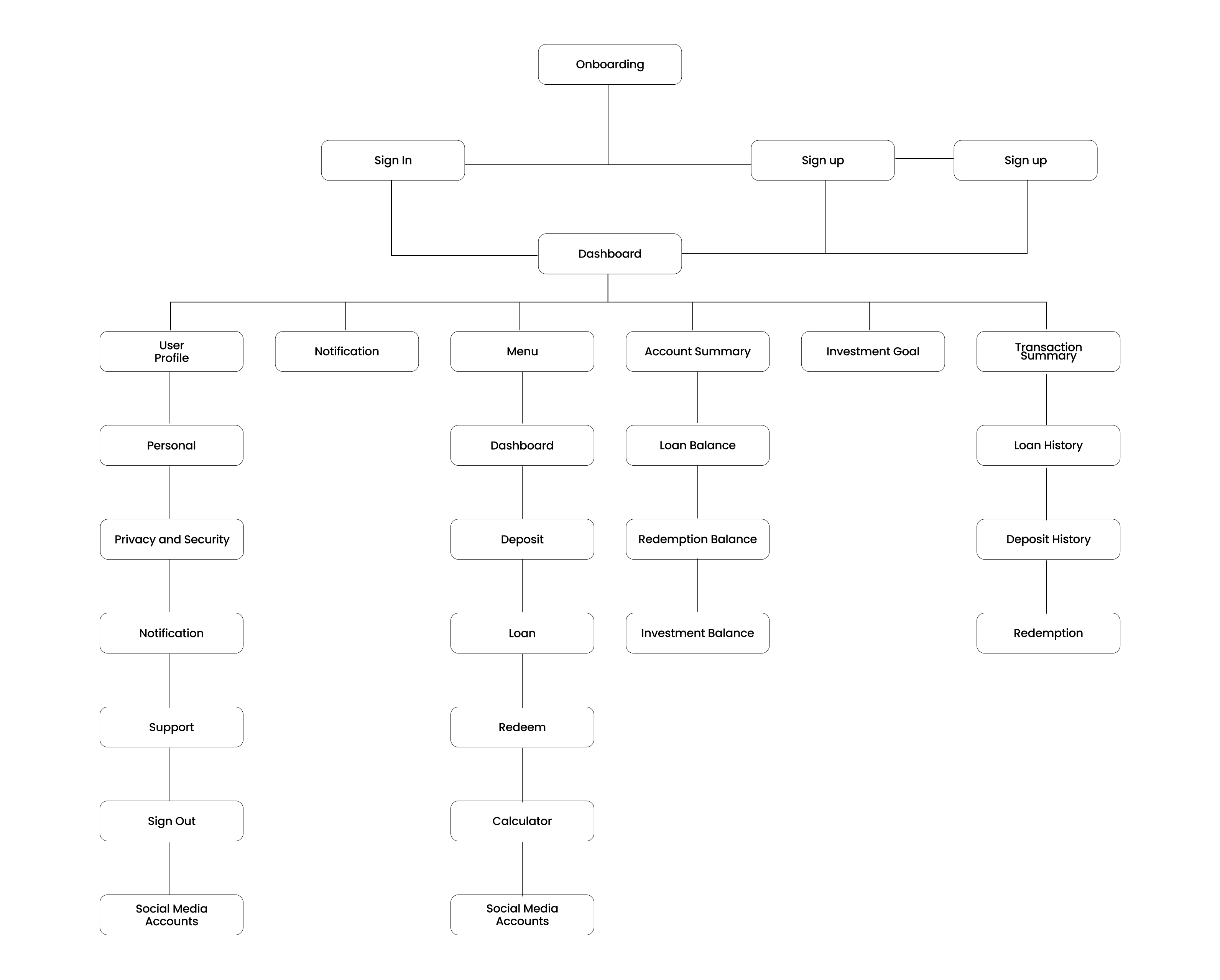
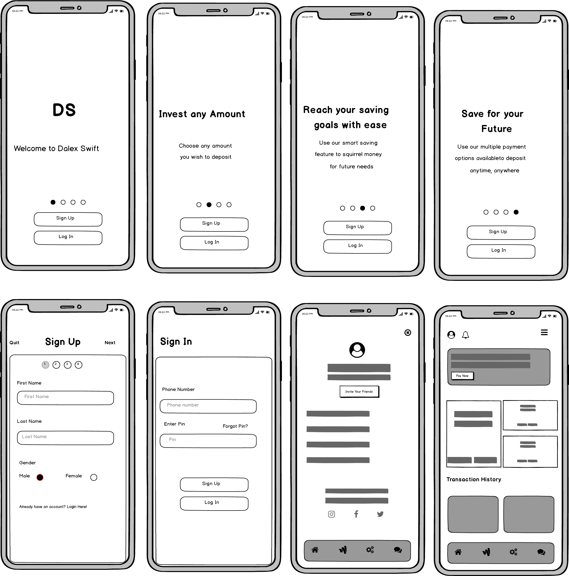
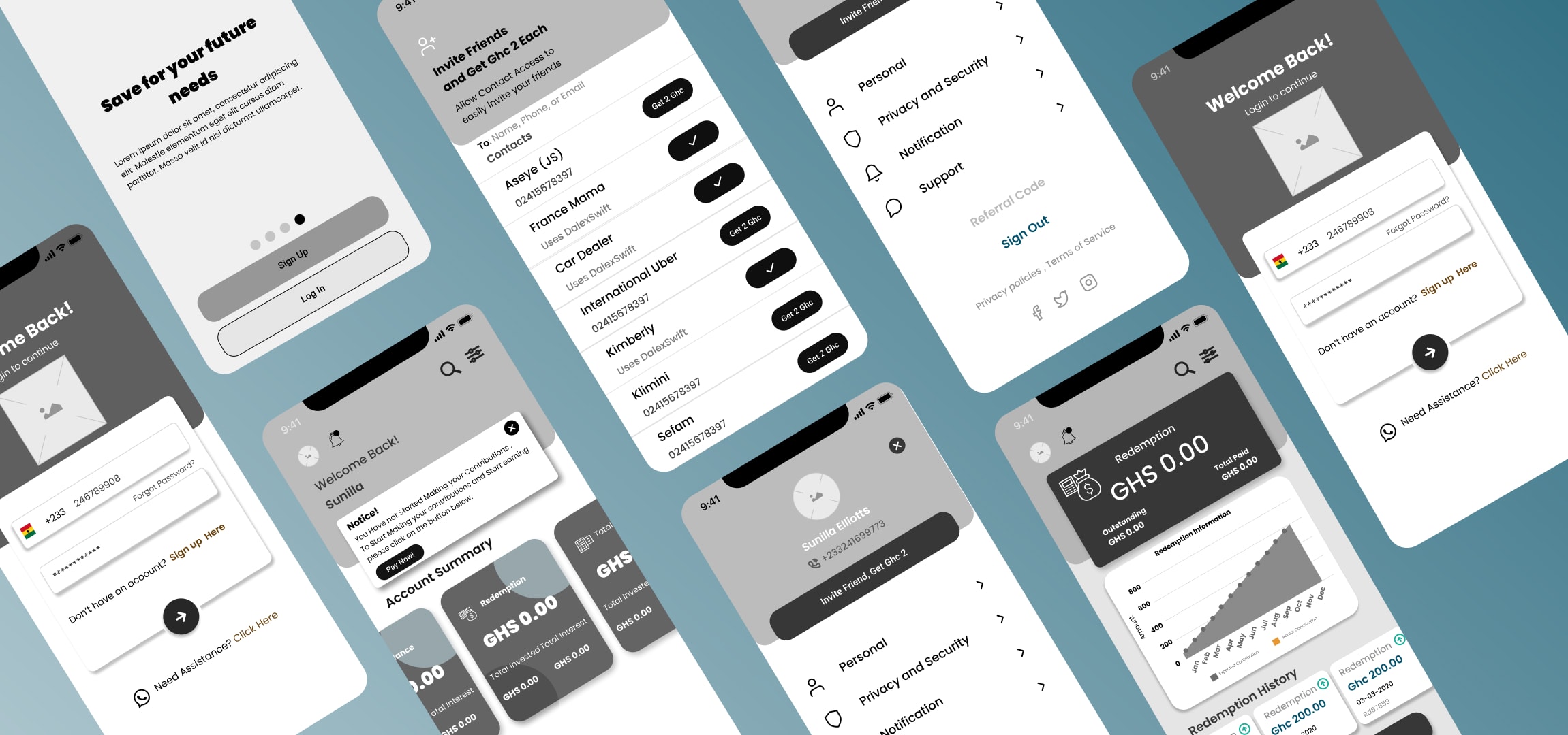
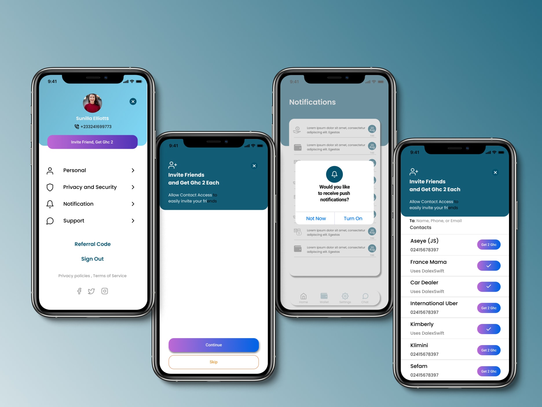
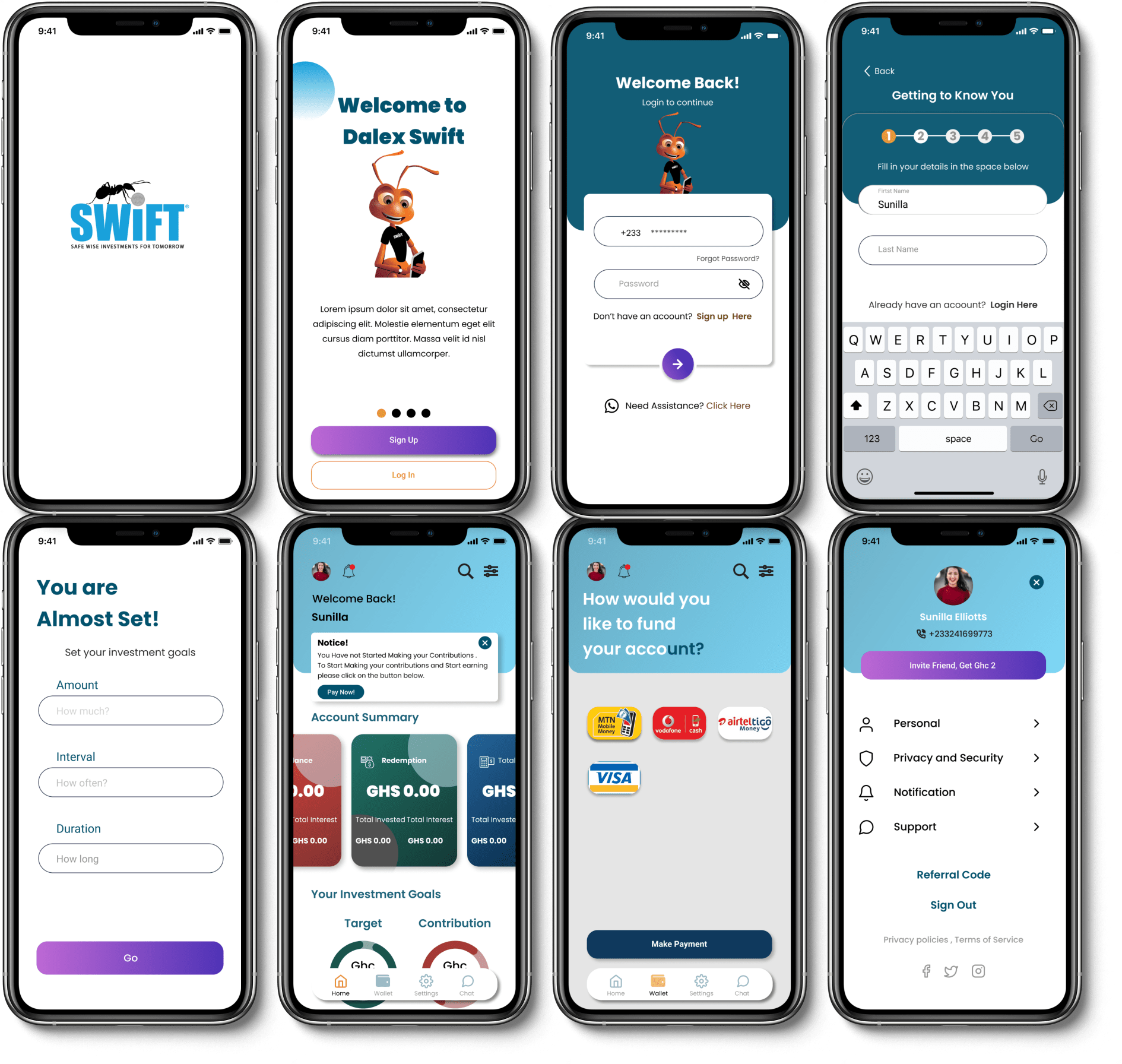
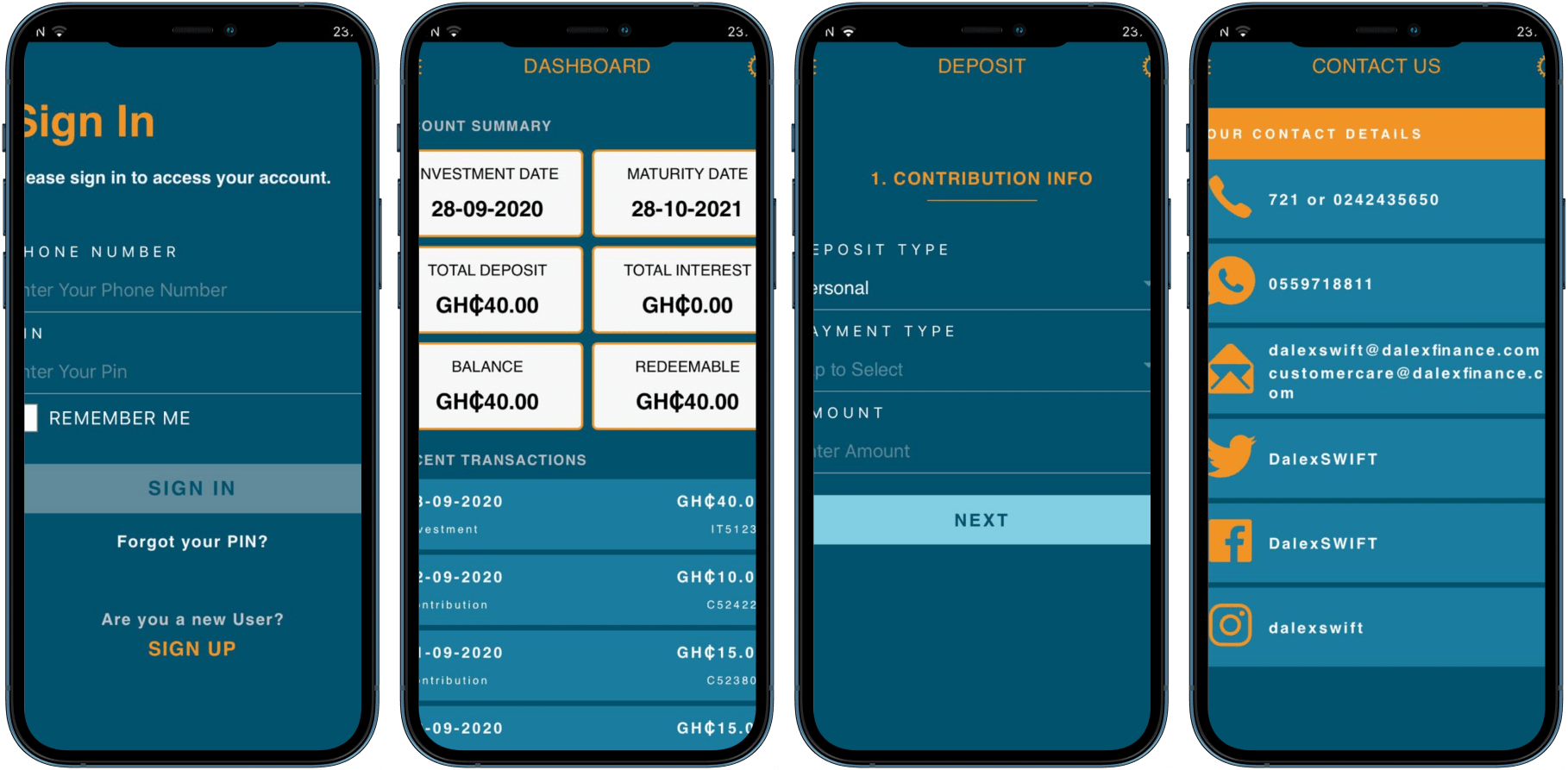
Based on the insights, findings and several rounds of ideation from the research I conducted early, on how to structure and design a more user centered and improve the user flows, I was able to narrow it down and created some more refined wireframes of the application.

Sketching the app ideas gathered at the stage of brainstorming helped me to translate the required features into a more understandable solutions that were dry to ran so the stakeholder could understand easily

Moving ahead step-wise from sketches to low-fi wireframes to describe the flow of the app and the logical structure of the elements that defined the features of the application. each case was rapidly prototyped into wireframes so we can understand the flows and ultimately define the information architecture of the product.

Low-Fidelity Wireframe

To be able to know if the solutions I arrived at after my brainstorming session really meet the needs of the target users I moved my idaes to Figma to design some low fidelity prototypes that I can test with users and be able to obtain their feedbacks and improve on them as soon as possible.

Usability Testing

For me to be able to validate the product ideas and know if my ideas really solves the problems of the users I identified earlier in the user research stage I conducted a usabilty test using Lookback which is a remote usability testing tool. I make use of user testing to explore potential solutions during the design process or test the waters during the product design cycle. Watching users try to accomplish tasks on early prototypes is the most effective and efficient way to uncover usability problems.

Solutions and Iterations

After a couple of ideation and brainstorming I came out with an idea to include a feature that allows already existing customers to invite their loved ones to sign up to the platform and get an amount credited to their DalexSwift account. I was able to incorporate this late requirement into the design without any negative impact on our final design.

After a couple of ideation and brainstorming I came out with an idea to include a feature that allows already existing customers to invite their loved ones and get an amount credited to their Dalex account.

iteration screens

Comparison

New User Interface
Previous User Interface

Conclusion

Challenges

After several rounds of testing and iterations I then started to feel I was on a right path to the final product. However, after 3 weeks to handling it over the developers, I came across a message asking the customer to invite friends and get reward for it. As a User Experience designer it is also part of my job to help the company grow its profit and increase its market share as well so, I have seen it as opportunity to modify my existing design and include a feature that allow users to invite their loved ones and get rewards

What I learned

Designing the app has been a challenging and rewarding journey. I understood the needs of the users through the survey and conversations. Finally, I faced the challenge of creating an engaging app both from the user experience perspective and the visual perspective.

Disclaimer

I am not affiliated with Dalex finance or Dalexswift in any level.
This is just for the sake of personal understanding